company DESCRIPTION
(Note: The SWAT app was an early iteration of the app that later pivoted to become the Raheem Messenger Bot, tracking and rating interactions with police.)
The SWAT app was designed to give a voice to the community, and encourage positive police behavior. It would allow users to stream live video of their interactions with police to secure servers, automatically files a complaint to the relevant oversight bodies, and keeps users updated as the investigation proceeds. Positive interactions with the police are rewarded. And the SWAT Database would provide policymakers, community leaders, and academics with real-time data on police violence as it occurs—a tool to create change.
PROJECT DESCRIPTION
This was a really short and simple project. Founder and CEO Brandon Anderson needed a prototype that could help his audience of investors and potential users understand how SWAT works and the value that it brings.
USERS
Adults and teens who want to record video of police interactions, and have the option to file police reports remotely.
Scope of work
- Usability analysis
- Evaluate existing UI screens for design and continuity gaps
- Create UI screens to streamline user flow, ensure consistency, and eliminate redundancy
- Create an interactive prototype. Click the image to experience >>
Project Timeline
- About 8 hours
PROGRAMS USED
- Adobe Photoshop, Marvel
UI Improvements
Most of the UI screens and visual design were done before the project came to me, but it needed more attention to the interaction design. An interactive prototype was the best way to take static screens and a Keynote presentation, and turn them into an easy-to-understand short and active story.
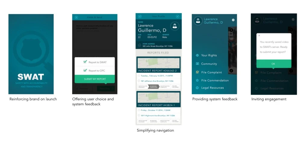
Even in a very short amount of time, UX heuristics can be applied to increase the usability of any product. Changes don't always need to be massive overhauls, especially when there is already quality design to build on. Small increases in system feedback, visibility of options, wayfinding, proper labeling, consistent link formats, and engagement recirculation can go a long way to making a product more effective and engaging.
These are a few of the adjustments I did to make SWAT more understandable, engaging and usable:
Results
I was able to get this product closer to launch-ready MVP by integrating interaction sequences and streamlining the process:
- Eliminating unnecessary screens
- Eliminating unnecessary links
- Incorporating common interaction design patterns
- Combining separate screens into scrolling screens
- Adding alert highlight colors
- Providing the user with modals at decision points
Feedback
User
"This is the most needed app in America." — Community organizer in Oakland, CA
USER
"This is amazing. I know so many people that have had their phones smashed or taken by the police at protests. Cops are always destroying evidence that can be used against them. But with an app like this this, they can't." — Activist, Oakland CA
Founder
"Kat is an enthusiastic, detail-oriented UX/UI designer who takes an incredibly thoughtful approach in her work — down to the tiniest detail. I needed help conveying to potential users how to use my app (prototype) and what the app would offer. Her design fleshed out unnecessary areas and streamlined the important ones.
Afterwards, Kat created a 60-second video demonstrating the full interaction, which was useful to my developer. I also inserted the video into my Keynote presentation, providing my audiences with a clearer picture of how the mobile app was to be used; the functions and wireframes. Kat's work is precise and thorough. I certainly recommend her to anyone looking to improve their design and reach their audience more clearly. I look forward to another chance to work with Kat again."
— Brandon Anderson, Founder and CEO of TheSWATapp
