This design was included in a Metropolitan Transportation Commission regional policy plan, called Plan Bay Area 2050, that aims to provide the Bay Area with a multi-service trip planner and transportation wallet.
Their vision, like my own, is to provide Bay Area residents with a single-payment experience that can be used across a variety of travel modes that are better connected to each other, reducing the need for individuals to own personal vehicles.
Learn more about that project at Toward a Shared Future: Strategies to Manage Travel Demand.
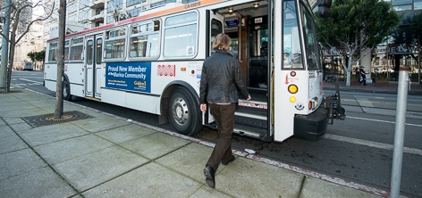
Photo credit: sfmta.com
GOALS
Demonstrate how quickly the UX process can be explored and applied, to craft research-backed solutions to real world problems:
Design an affordable and easy solution allowing city-dwellers to go easily between multiple public transit services, managing their daily, weekly and monthly needs.
USERS
Bay Area residents who use public transportation at least once per week. In particular, users who use public transit regularly for work commutes.

PROJECT GOALS
Discover users' challenges and needs when using public transportation
Envision and design possible solutions
SCOPE OF WORK
Online survey
Phone interview
Data compilation
Data analysis and synthesis
Sketches and Mockups
Interactive Prototype
Project Timeline
9.5 hours (Personal challenge to see how much I could get done in one weekend)
PROGRAMS USED
Typeform, Google Forms, Sketch, InVision
Research
To kick off this experimental project in designing a mobile solution in support of public transit riders, I knew I would need/want to do some research to inform my awareness and design direction. I have lots of familiarity with BART (Bay Area Rapid Transit) trains, I drive often, and I only have a miniscule amount of experience with MUNI. This was a fun project because I felt like I had a lot to learn. I sought out this knowledge in three ways:
Researching the various Bay Area transit services via their own websites/apps
Gathering insights from transit riders via a quick online survey about their needs, priorities, and current trip-planning methods
Interviewing someone at the core of the Bay Area transit community: Ilyse Magy, the Community Organizer and sole staffperson of the SF Transit Riders Union.
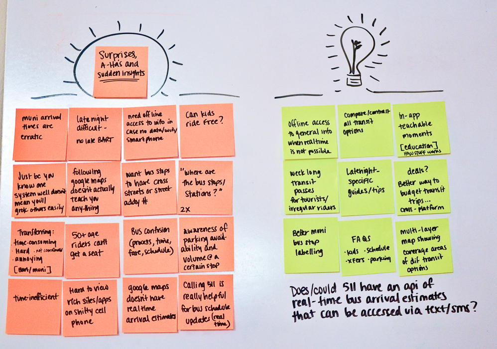
I was able to get some quick and valuable insights via the online survey. Most users relied on BART and Muni for their public transportation needs, and depending on how experienced they were with those systems their planning strategies ran the gamut: relying on memory, official websites, Google Maps, paper schedules and apps like Quicky, Routesy, CalTrain, and NextBus.
Frustrations and pain points included delays, inaccurate schedules, wrong arrival times, crowding, difficulty transferring between BART and Muni, older riders not being given seats by younger riders, parking, uncomfortable waits, and confusion about how the different transit systems actually work.

Interview Summary
The SF Transit Riders Union is a grassroots organization of current and future riders working to achieve an excellent, affordable, and growing transit system in San Francisco. They work with the San Francisco Municipal Transportation Authority, city council and local citizens to effect positive change in the policies governing transit in the city. I interviewed their sole staff person and community outreach coordinator to learn what she felt were the biggest challenges and opportunities in this area.
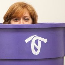
Ilyse Magy, SFTRU


Synthesis & Brainstorming
My next steps were to analyze and synthesize the survey data and dig into ideation with some whiteboard concepting.


Design / Direction
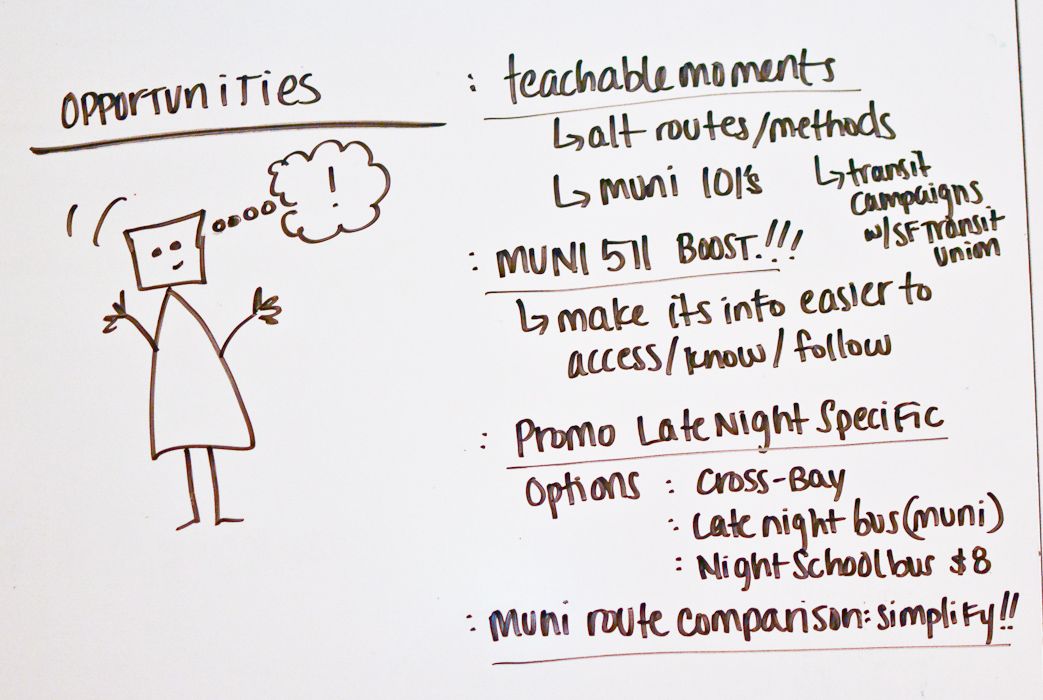
I chose to prioritize three goals:
1) Make it easier to understand where Muni routes go.
2) Make it easier to compare routes across different providers.
3) Provide an easy way to access real-time arrival estimates for commonly-used routes.
1 & 2: A frustration highlighted by Ilyse on behalf of local transit riders: the challenge of understanding which MUNI route goes where. She mentioned that even the bus stop doesn't have an easily digestible single-route view for a single MUNI line. This singular piece of data is something that many users need but which, for some reason, is hard to find. It's also very hard to compare and combine information from different transit providers.

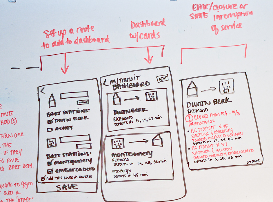
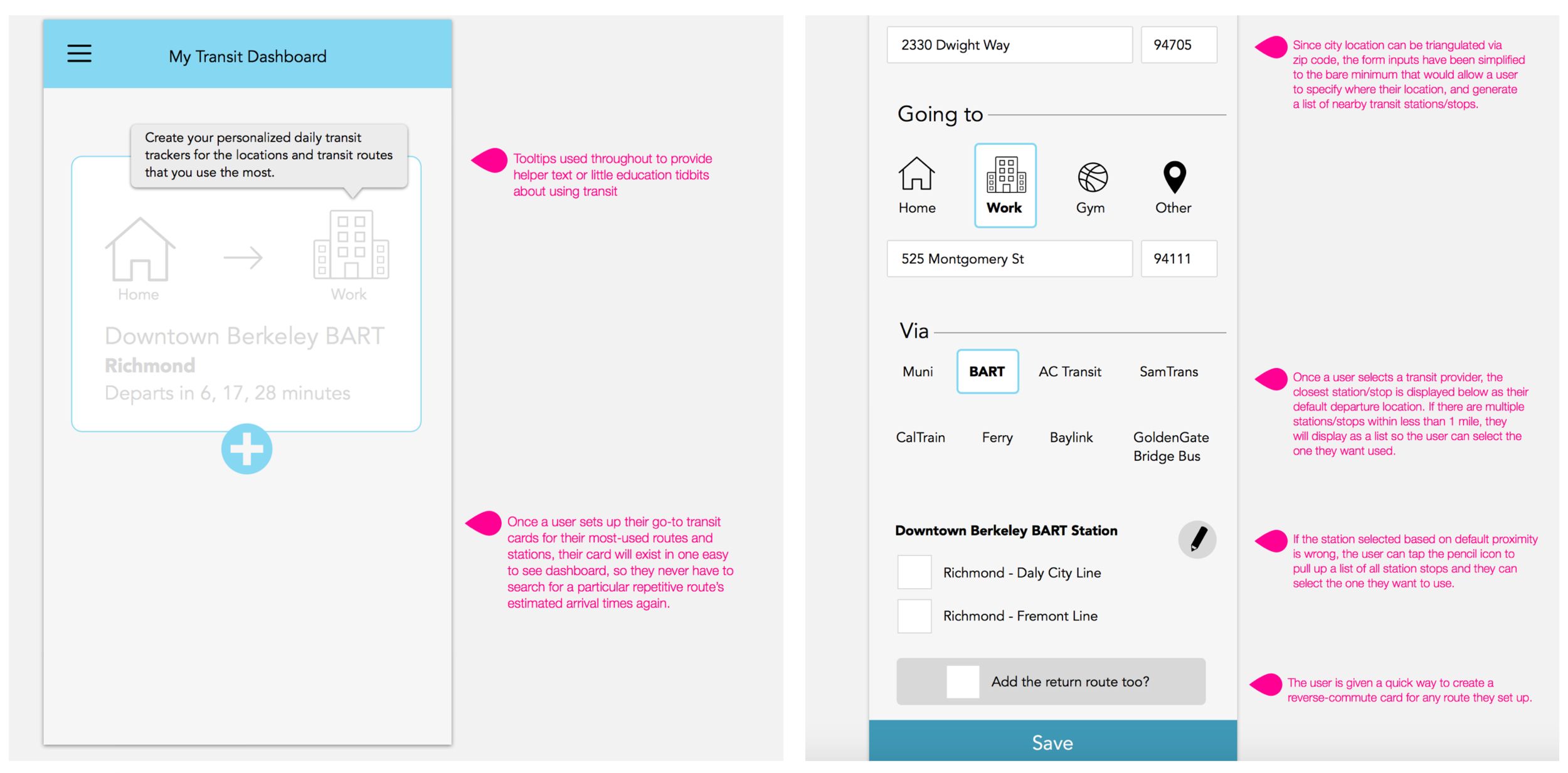
2) I decided to give the user the option to create a customized dashboard with their preferred transit methods and routes to/from their most-commonly used locations, integrating realtime schedules/countdowns of multiple transit services. One thing I learned in my research is that many users have to bounce between different apps that are solely dedicated to one transit method (ie. only BART, or only MUNI) when their lives regularly cross the borders of single-transit service areas. If the user had a single dashboard with a quick peek at their daily/weekly/monthly routes, that would prevent them having to check multiple apps and websites.

The 511 site is great for planning transit and getting up-to-date information about transit arrival statuses, but its visual design and UX are in deep need of attention, and users spoke about their frustration and difficulty viewing/navigating it. Arrival status info is also available via 511 phone call or text, but it doesn't sound like a lot of people are aware of that. Plus calling and texting are repeatable efforts that the user has to make.
I decided to bring 511's most useful feature (ie. realtime arrival estimates) to the forefront. In my product design, the user only has to set up their tracker once, which will save them from wasting time checking transit statuses later when they are on the go.
My goal was to surface the route and arrival/departure times in a clean, easy-to-read card that refreshes each route's arrival/departure times on its own using info from 511.
Prototype

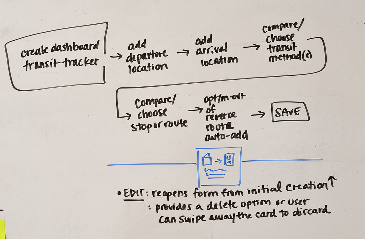
This basic design illustrates the key pieces of functionality that I prioritized in the product.
Main interactions:
My Transit Dashboard
Create a new transit tracker from preset locations such as Home, Work, Gym, or Other (user may set).
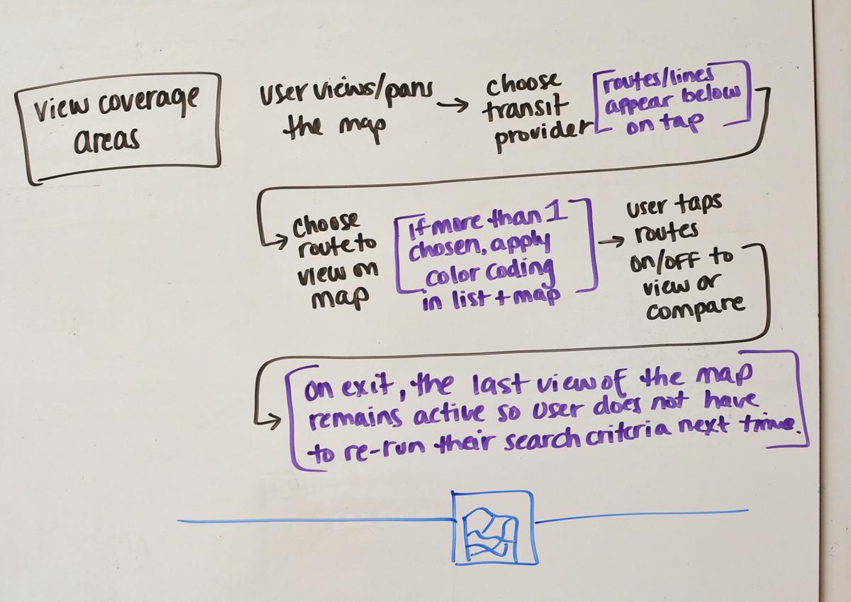
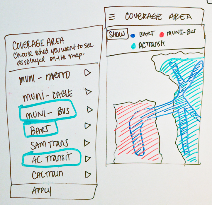
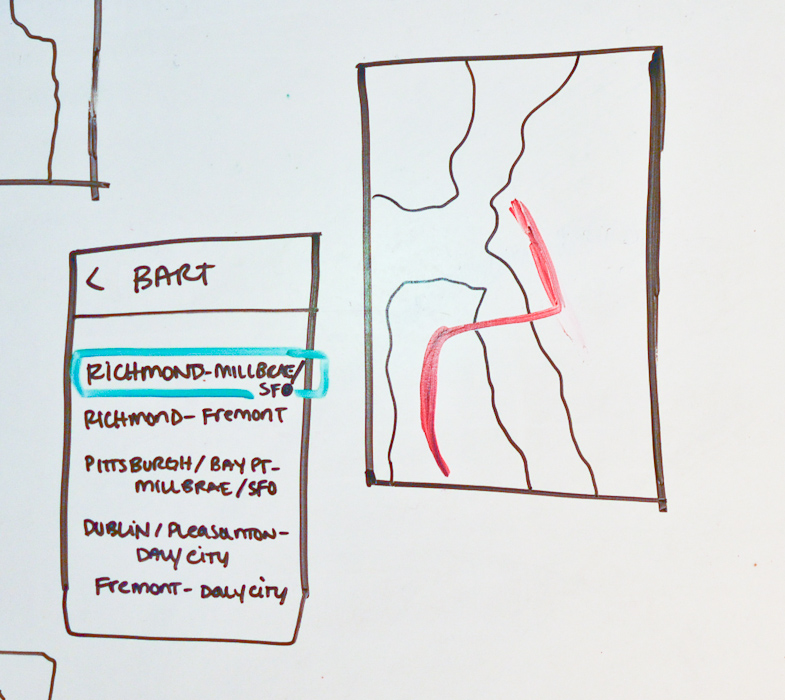
Coverage Map
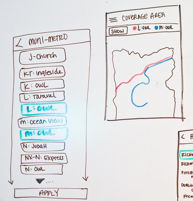
View how and where different transit methods meet and overlap their coverage. In the example on the left, when both Muni's K-Owl and N-Judah routes, and BART’s Richmond line are toggled on in the map, the user can see where they intersect.
Closing thoughts
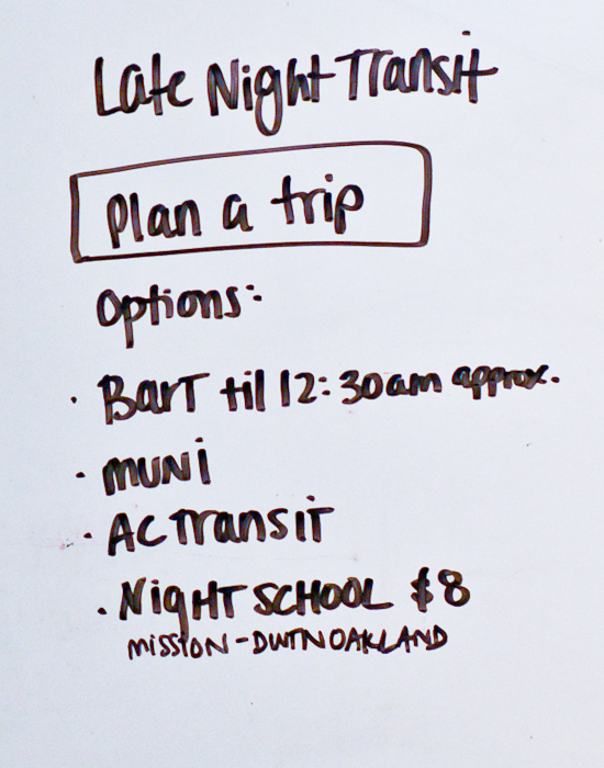
If I were giving this project more time than just the weekend I carved out for it, I would have delved a lot more deeply into developing additional functionalities, such as coming up with specific flows for the late-night traveler, or the someone who wants to learn more about the Bay Area's transit options overall. I would have also developed my ideas for how to handle errors, and situations when one of the transit providers (ie BART) is out of service so the app can provide them with a list of alternative transit methods for completing one of the saved routes on their dashboard.
I discovered a lot of opportunities to educate the user about how many options really are available to them. One user replied in her survey response that all she does is check GoogleMaps:
" i have no idea how any of the trains or buses actually work...i'm a slave to tech! :( "
I would want to include an area of the product and call-to-action for the user to learn a new fact about their local transit service every so often when they have the app open. Since most people are just reading, listening to music, or playing with their phone while they ride transit, that's a prime opportunity to give them little bits of knowledge that will empower them more when it comes to knowledge and access to their transit opportunities.
It would also be cool to provide users with info about SFTRU in an About section in case they uncover a passion for transit rights and want to get more involved.
With more time, I would have also crafted a more refined visual design design for the prototype. I would have also wanted to complete the full UX process including usability testing, additional iterations, etc. For now though, this gets the job done and illustrates the functions and features that users expressed were a priority.
I had a blast with this project and hope you enjoyed seeing how, even in a short amount of time, a basic UX process can be explored and applied to solving real problems for real users.
Time spent on project: 9.5 hours
30 min: Set up and distribute online survey
30 min: Interview with Ilyse Magy
30 min: Follow-up communication (with Ilyse and survey respondents)
2.5 hours: Analysis, synthesis, brainstorming, whiteboarding
5.5 hours: Wireframing (analog/digital), design, prototyping, refinement, documentation